
A plea to publishers and printers.
I fell in love with a book, 100% judging it by the cover. Then I opened it. It was horrifying. Nothing wrong with the type, the words, the paper, or the binding but it was a book that did not ‘want me to read it’. Unless I forced it open, it would snap shut. Mocking me.
Unfortunately for authors, this is far too common. Thousands of books are published and printed around the world incorrectly, where the pages are stiff, don’t bend, and are resisting being opened. A lovely lady recently came to me complaining she couldn’t read her bespoke, one-off, hardcover biography she had recently produced by an Auckland printer. She didn’t know what was wrong but she knew something was wrong with her book. Her elderly hands could not hold it open, she wondered if the paper was too thick (it was, but that’s beside the point). I looked at the binding from the top and it looked OK, opened it up near the middle, held some pages and instantly my heart sank. The grain was wrong. She had paid a couple of hundred dollars for her single copy to be made and the book didn’t ‘want to be read’.
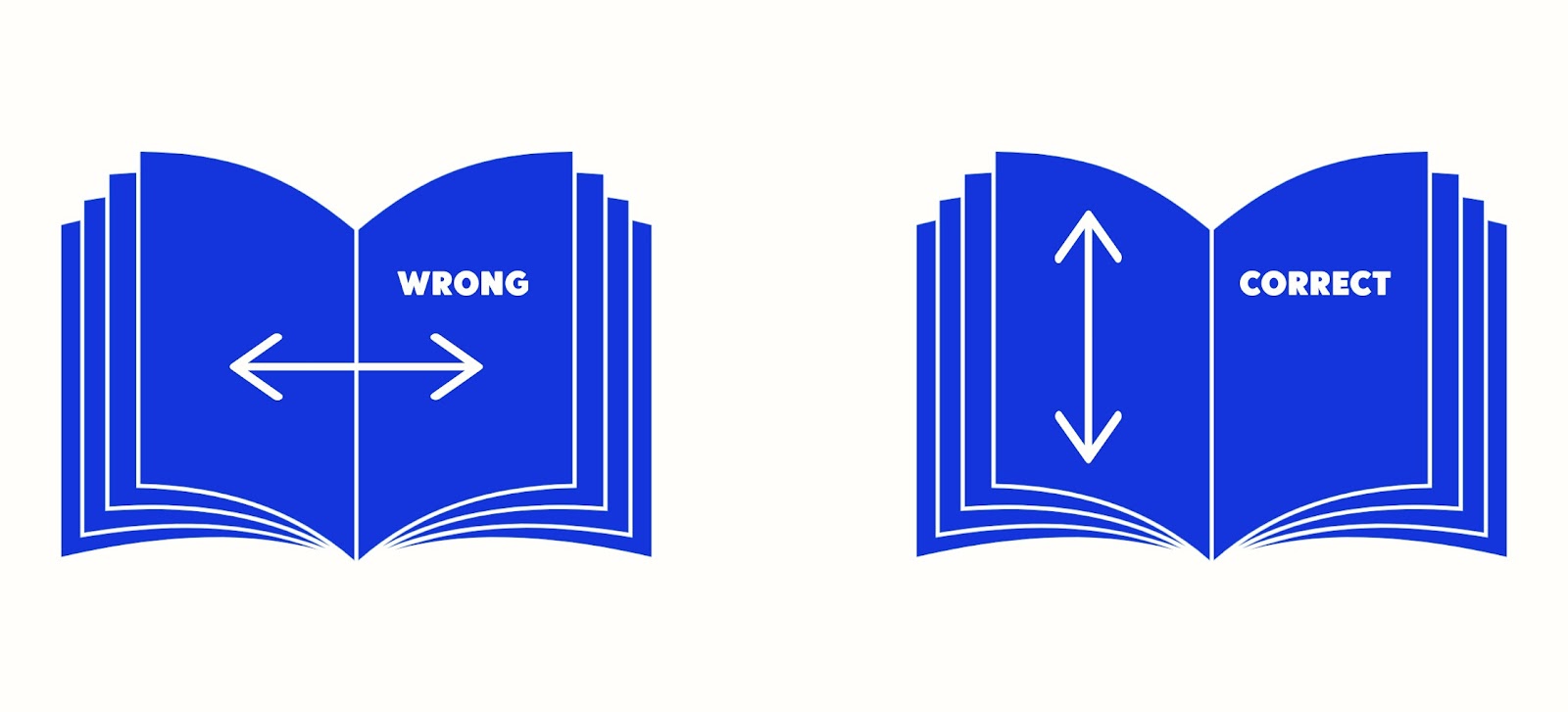
When a book is made on the right grain you can hold open a paperback with one hand, you can place a hardcover, section sewn book open on the table and it will stay open.
Have you noticed how paper towels and newspapers rip cleanly in one direction and not another? That is the paper grain at work. You know when you fold a piece of card and it cracks along the fold? Again that is grain at work.
Like wood, paper has a grain, it runs across the sheet horizontally or straight up and down, from ‘head to tail’. For many printed letters, posters, business cards, and the like, the grain is irrelevant because the product isn’t designed to bend or flex. Because of this irrelevance, many printers ignore the grain direction and just purchase a paper that fits the printing spec.
When it comes to books it is the most important element of paper choice. And where many printers, even book printers, fall over.
With books, we are binding multiple sheets together with glue or staples, and a book is designed to open, lay flat, be flicked through, and so on. If the grain runs correctly from head to tail then the paper will flick intuitively. With the correct grain, you can fan the pages, it is ‘happy’ to open, and won’t resist and force itself shut. It also will work WITH the binding and not ‘pop’ out of the binding with use, or crack along the cover folds.
It is the most simple concept and the most essential element in book production. The wrong grain will ruin a book, the right grain makes the book work.
Publishers choose a printer for the quality of their work, 9 out of 10 times there will be no difference in price; it is simply about ordering the sheets of paper with the correct grain for the job. The 1 out of 10 would be in an instance where the paper you want to use only comes in one grain option and limited sheet sizes. To use this for printing AND maintain the correct grain (head to tail) a printer may only be able to print ‘2-up’ instead of ‘4-up’ so your paper and printing costs double).
One instance in bookbinding where the grain does not have to be considered is spiral binding, where oftentimes I actually prefer to use the ‘wrong’ grain to enhance the stiffness of each sheet and make it less easy for a sheet to tear from the spiral. This is the only exception and it is possible to break the rule because we are not gluing or stapling the sheets together, they are ‘loose’ in the binding. Keep in mind though that you will lose the flexibility and the pages won’t ‘flick’ or ‘fan’ properly in this case.
One instance in ‘paper’ choice is when using synthetic stocks (chosen for waterproof or tear-proof publications). A synthetic stock by design does not have a grain and therefore will not cause the same issues as a paper stock would.
A message to publishers both professional and independent, if a printer cannot manage to find the correct grain of paper for your printed book they should not try to make the book at all. If they supply a book with the wrong grain you have every right to request a new print run. It is not OK to produce a book on the wrong grain stock. You are not responsible for knowing this, nor are you responsible for making sure they are using the correct grain stock. You can, however, with your newfound knowledge, ask the question of the printer and could help them do their job by ensuring they will in fact produce a book where the pages (and cover) are the correct grain.
A message to printers, take a second to consider the grain direction when ordering your paper. It is easy to find the information and only takes a minute to determine your cut sheet or roll fed grain direction and then translate that knowledge into how best to impose the print file so that the finished book blocks, section sewn or otherwise, are going to work as a book should once bound. It is your responsibility in making a book to use the correct grain (even if you are just doing the print and sending the book for outsourced binding). And if you make a mistake I urge you to offer a reprint as there is nothing more heartbreaking than a publisher seeing their work in print and discovering the book doesn’t open properly.
This is not new information, this is not a hack, it is ‘Printing 101’. Book stocks, be it covers, endpapers, or inside pages, need to have the grain running vertically or parallel with the spine, in layman’s terms head to tail.


